How to Make Documents Look More Professional in 2026: The Ultimate Guide
Would you trust a million-dollar contract that arrived bound with a flimsy plastic paperclip? In a 2026 business environment where digital-first workflows are the norm, a physical document must feel like a premium experience to be effective. We understand how frustrating it is when your team's hard work is undermined by inconsistent formatting or a finish that doesn't match your professional reputation. You want to know how to make documents look more professional without the constant expense and delay of outsourcing every project.
You can achieve the same polished results as top San Diego firms by mastering a few specific digital design and physical finishing techniques. This guide provides a clear checklist for digital precision using the latest 2026 Adobe Creative Cloud updates, a framework for selecting the right binding and covers, and a repeatable process for high-quality in-house production. We'll show you how to transform a simple stack of paper into a tactile tool for professional storytelling that commands respect from the very first touch.
Key Takeaways
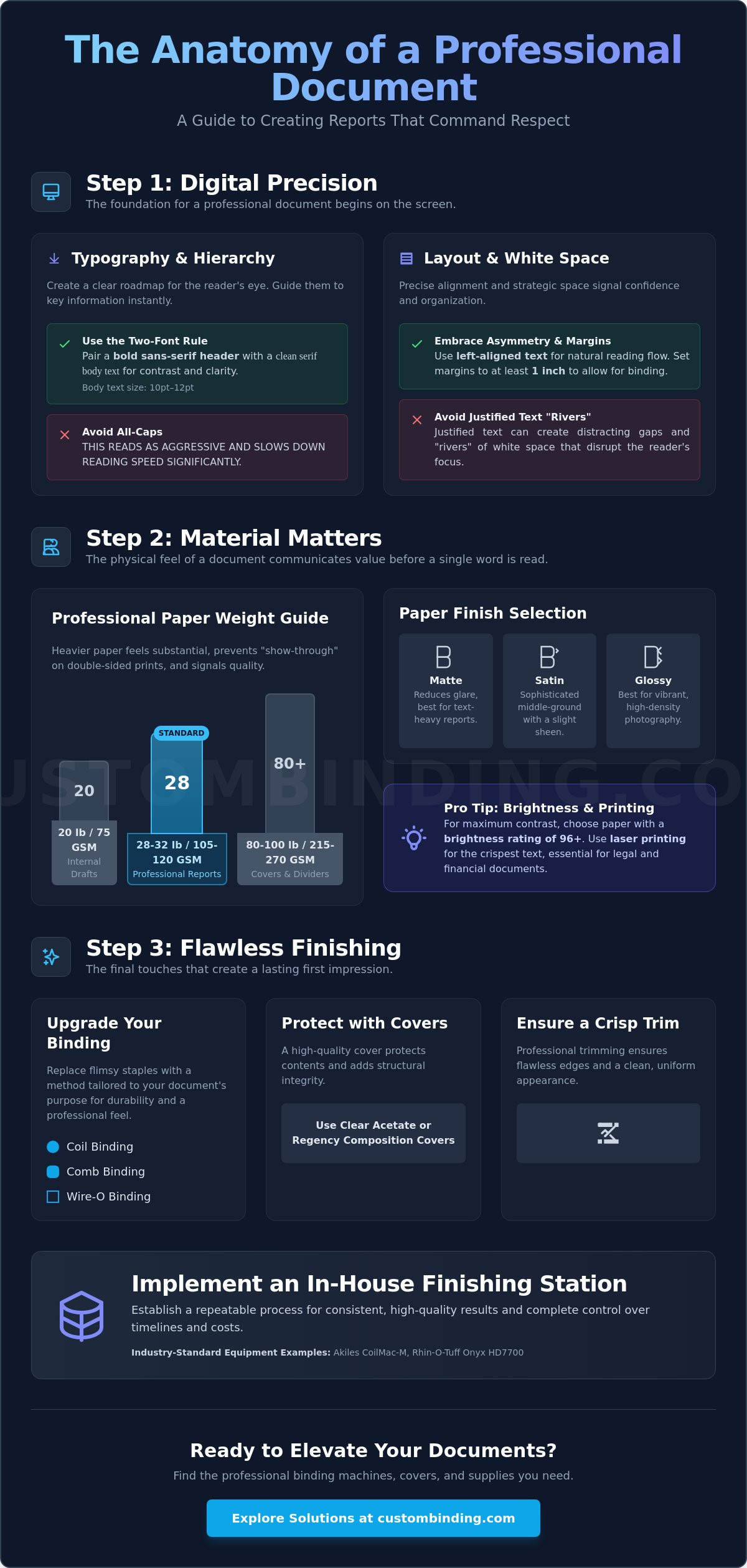
- Master visual hierarchy and the strategic use of white space to guide your reader's eye toward critical information immediately.
- Understand how paper weight and specific finishes like matte or satin influence the tactile perception of your work's quality.
- Learn how to make documents look more professional by replacing standard staples with high-quality binding methods tailored to your document's purpose.
- Utilize clear acetate or Regency composition covers and professional trimming to ensure a flawless first impression and long-term durability.
- Establish a repeatable in-house finishing process using industry-standard equipment like the Akiles CoilMac-M or Rhin-O-Tuff Onyx HD7700.
The Foundation: Digital Design and Visual Hierarchy
Visual hierarchy is the strategic arrangement of elements to signal importance. If you're wondering how to make documents look more professional, the transformation begins long before you hit the print button. By applying established principles of visual hierarchy, you guide the reader's eye toward your most critical data points first. This structure reduces cognitive load and allows busy executives to scan for key insights without getting lost in a wall of text.
White space is often misunderstood as wasted territory, but it's actually a powerful psychological tool. In high-stakes business proposals, "less is more" signals a quiet confidence in the quality of the work. Overcrowded pages appear cluttered and can make your firm look disorganized or desperate for attention. To prevent this, implement a strict internal style guide. This document should standardize everything from header weights to the density of information allowed per page. Consistency ensures your brand identity remains professional, whether the document was created by a junior analyst or a senior partner.
Typography and Font Pairing for 2026
In 2026, professional typography must perform equally well on high-resolution screens and physical paper. We recommend the "Two-Font Rule" to create immediate visual interest and clarity. Pair a bold, modern sans-serif for your headers with a clean, high-contrast serif for your body text. This contrast creates a clear roadmap for the reader's brain. Keep your body text between 10pt and 12pt for optimal legibility. Don't use all-caps for long sentences; it often reads as aggressive and significantly slows down the reader's ability to process your message quickly.
Alignment, Margins, and White Space
Precise alignment is a non-negotiable hallmark of professional design. Always favor left-aligned text over justified text. While justified blocks might look neat at a distance, they often create "rivers" of awkward white space that disrupt the reading flow. When you are planning how to make documents look more professional for physical assembly, set your margins to at least 1 inch. This specific measurement provides the necessary clearance for binding punch holes, ensuring your text isn't clipped during the finishing stage. Finally, replace outdated double-spacing with consistent paragraph spacing. This achieves a contemporary, streamlined aesthetic that feels intentional and modern.
Selecting Materials: Paper Weight and Printing Standards
The physical feel of a document communicates as much as the words on the page. When considering how to make documents look more professional, the tactile experience is your first opportunity to establish authority. 100 GSM (28lb) paper is the professional baseline for reports. Using anything lighter risks a "cheap" or flimsy impression that undermines your digital design efforts. A heavier sheet feels substantial and signals to the reader that the information within is valuable and permanent.
The choice of finish also dictates how your reader interacts with the content. Matte finishes are the standard for text-heavy reports because they minimize glare and improve readability under harsh office lighting. Glossy finishes work best for marketing brochures with high-density photography, while satin offers a sophisticated middle ground. For organizations requiring rigorous quality control, adhering to Government Paper Specification Standards ensures your materials meet the highest industrial benchmarks for durability and opacity. Don't overlook color calibration; ensuring your printed brand colors match your digital assets requires consistent profiles across your design software and printer hardware to maintain brand integrity.
The Professional Guide to Paper Weight
Standard 20lb office paper is suitable for internal drafts but lacks the opacity needed for double-sided professional reports. Upgrading to 28lb or 32lb premium bond paper prevents "show-through" and provides a substantial weight that feels significant in a client's hands. For internal dividers or front and back covers, we recommend using 80lb or 100lb cardstock to provide structural integrity. Pay attention to brightness ratings as well. A rating of 96 or higher ensures that your blacks are deep and your colors pop against a crisp, white background, providing the high-contrast look that defines premium documentation.
Printing Techniques for High-Stakes Documents
Crisp text is the hallmark of a professional document, which is why laser printing remains the preferred choice for legal and financial filings. Laser printers use toner that bonds to the paper surface, resulting in sharp characters that won't smudge or bleed. If your design includes edge-to-edge color, you'll need to use full-bleed printing. This involves printing on a slightly larger sheet and using a professional trimmer to remove the white borders. Always verify that your printer settings are set to high-resolution, at least 600 DPI, to avoid pixelated logos or grainy graphics. Selecting the right materials is an investment in your firm's reputation, and you can find a curated selection of premium document supplies to elevate your next presentation.
The Professional Binding Advantage: Choosing the Right Style
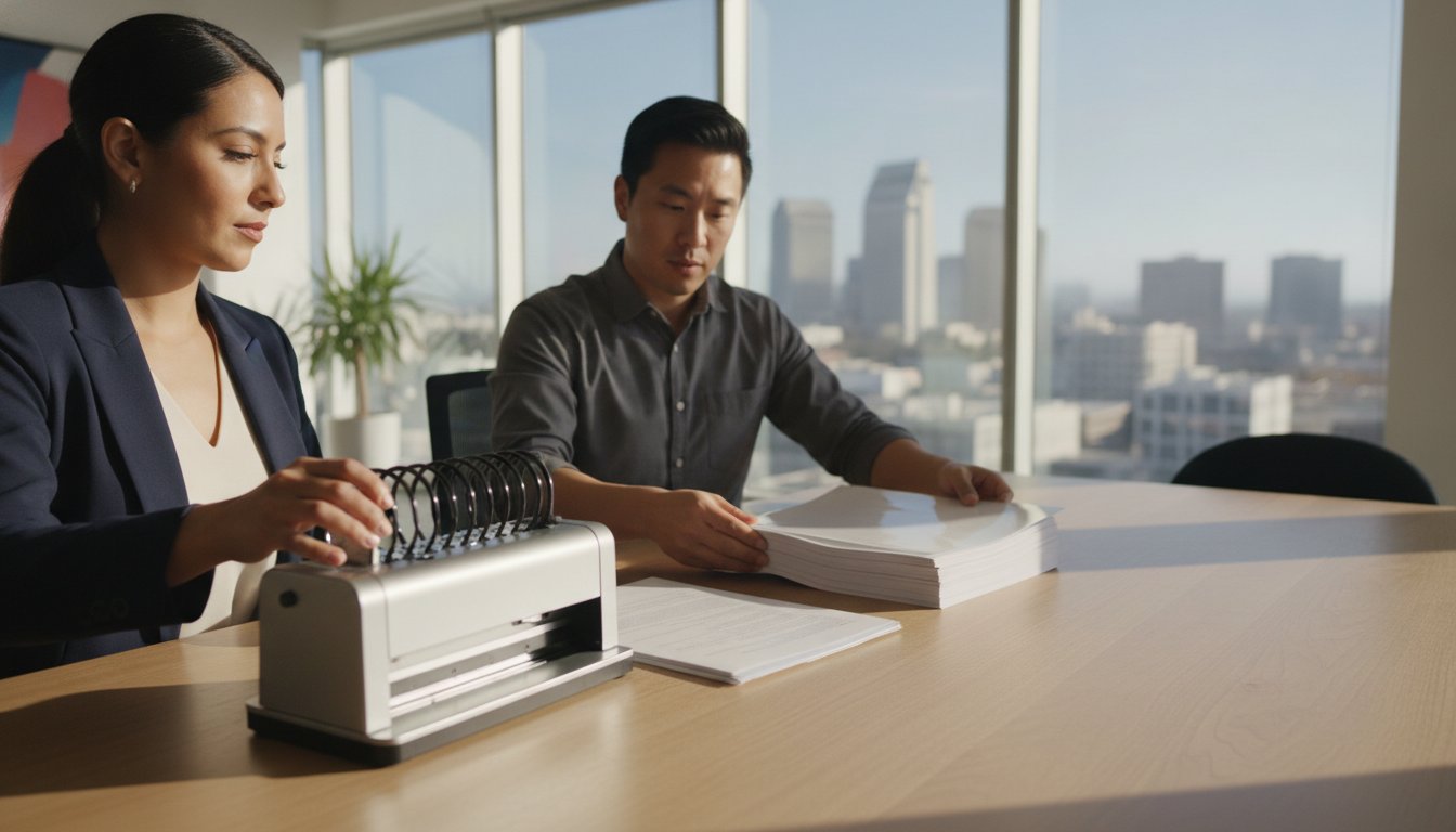
Once you have perfected the digital layout and selected the ideal paper stock, the final assembly determines the document's longevity and impact. Understanding how to make documents look more professional requires moving beyond the standard office staple. For any document exceeding five pages, a staple is the primary "professionalism killer." It suggests a lack of preparation and makes the document difficult to read or photocopy. Instead, view binding as the structural frame that holds your professional narrative together, providing a finished quality that a simple corner clip cannot achieve.
The choice of binding should align with the document's intended use and the recipient's expectations. For example, technical manuals and workbooks benefit from lay-flat binding, which allows the user to reference the material hands-free. This mechanical advantage isn't just about aesthetics; it's about the user's experience with your brand. Selecting from various professional binding methods ensures the physical structure matches the gravity of the content, transforming a stack of paper into a cohesive, high-stakes asset.
Coil vs. Wire vs. Comb Binding
Choosing the right consumable is critical for a polished result. Plastic Spiral Binding Coils are the modern standard for high-use documents like training manuals or field guides. They are exceptionally durable, maintain their shape under pressure, and allow the pages to wrap 360 degrees. For high-end proposals and executive portfolios, Twin Loop Binding Wire offers a sophisticated, "executive" look that signals premium quality. If you are producing internal reports that require frequent updates, plastic comb binding remains a cost-effective, editable solution that allows you to add or remove pages as needed without destroying the bind.
Specialized Binding for Niche Projects
Certain high-stakes environments require specialized security or aesthetic features. VeloBind and other secure binding styles create a tamper-resistant finish, making them the preferred choice for legal briefs and financial filings where document integrity is paramount. If your goal is a "book-like" spine for an annual report or a corporate history, thermal binding provides a clean, professional edge without visible holes or coils. For architectural portfolios or swatch books, screw post binding offers a versatile and rugged option that can accommodate varying thicknesses while allowing for easy page replacement. By matching the hardware to the project's specific needs, you ensure the final product reflects the precision of the work contained within.
Document Finishing: Covers, Lamination, and Trimming
The "First Impression" rule dictates that the front cover is the most critical page of any presentation. It's the handshake of your document. When you are determining how to make documents look more professional, the finishing stage is where you bridge the gap between a simple printout and a high-stakes corporate asset. Clear acetate covers protect documents while showcasing title pages, allowing your carefully designed visual hierarchy to remain visible while providing a durable barrier against moisture and handling.
Selecting Professional Report Covers
Choosing the right cover material depends on the level of formality and the intended environment. Clear Acetate Covers come in high-gloss or matte finishes. High-gloss provides a vibrant, modern look that makes colors pop, while matte finishes reduce glare in bright office settings. For a more traditional or heavy-duty feel, Regency Composition Covers offer a leatherette texture that adds weight and prestige to the final assembly. You can further elevate your brand by customizing these covers with window cuts or foil stamping, ensuring your firm's identity is the first thing a client sees.
Lamination Standards for Durability
Lamination significantly increases the lifespan of frequently handled documents, preventing the wear and tear that can make a presentation look "cheap" over time. For single-sheet reference guides or ID cards, laminating pouches provide a quick and effective solution. When dealing with large-scale production runs, roll laminating film is the more efficient choice for maintaining a steady, logical workflow. The mil thickness you choose matters; 3 mil film offers flexibility for pages that need to be turned easily, whereas 10 mil film provides rigid, armor-like protection for documents that must withstand heavy industrial use.
The Final Touch: Corner Rounding and Trimming
Precision trimming is what separates an in-house project from a commercial-grade publication. Using Dahle Professional Rolling Trimmers allows you to remove the white border common in standard printing, achieving a true full-bleed finish. This small detail significantly impacts how to make documents look more professional by creating perfectly straight, clean edges. Additionally, consider the subtle impact of corner rounding to prevent dog-eared pages on frequently used manuals. For large mailings, using a Martin Yale paper folder automates the process, ensuring every fold is crisp and uniform. To achieve these results in your own office, explore our full range of professional finishing equipment and supplies.
Implementing a Professional Finishing Station in Your Office
Transitioning to an in-house finishing station is the final step in mastering high-stakes document production. It eliminates the logistical delays of outsourcing and gives your team total control over every tactile detail. Investing in the right hardware, such as the Akiles CoilMac-M for manual precision or the Rhin-O-Tuff Onyx HD7700 for high-volume environments, ensures that your output remains consistent. By bringing these tools into your workspace, you establish a repeatable standard for how to make documents look more professional without relying on external vendors who may not share your commitment to detail.
Organizing your supply chain is equally important for maintaining momentum. Maintain a dedicated inventory of plastic spiral binding coils, twin loop wire, and laminating film to avoid project bottlenecks during peak seasons. For firms based in San Diego, leveraging local expertise for equipment selection and maintenance provides a distinct operational advantage. Local support ensures your machines are calibrated correctly and that you have a steady supply of high-quality consumables ready for the next high-stakes deadline. This local partnership prevents the friction often associated with national supply chains; for example, you can learn more about Cardenas & Company Real Estate Group to see how a premier local team maintains professional excellence in their client relations.
Essential Equipment for Modern Offices
Choosing between entry-level and heavy-duty systems depends entirely on your monthly document volume. While a manual punch is ideal for smaller firms, a high-capacity electric system like the Rhin-O-Tuff Onyx is a necessity for large departments that produce hundreds of reports weekly. The Tamerica Optimus-450 has become a San Diego workhorse because it combines high-performance lamination with user-friendly controls, making it accessible for any staff member to operate. Additionally, don't overlook the ROI of automatic paper folders from Martin Yale. These machines automate repetitive folding tasks, allowing your staff to focus on high-value work while ensuring every mailing or brochure is crisp and uniform.
When your professionally bound documents are ready for distribution, the quality of the shipping materials is just as important as the content itself. For high-performance thermal printing solutions, DuraFast Label Company provides the specialized supplies needed to ensure your logistics and branding remain consistent from the desk to the doorstep.
Maintaining Quality and Longevity
To protect your investment, implement a strict schedule for equipment maintenance. Regular cleaning and professional repair prevent mechanical failures that can ruin expensive print runs or cause unsightly punch misalignments. Sourcing high-quality wholesale supplies, such as Regency composition covers and clear acetate, reduces your cost-per-document while maintaining the premium aesthetic established in previous sections. Training your staff on these document finishing standards ensures that quality control remains high, regardless of who is operating the equipment. Ready to upgrade your office presentation? Explore our professional binding systems to find the perfect solution for your firm's specific needs.
Master the Art of High-Stakes Presentation
Mastering the final presentation is about bridging the gap between digital precision and tactile excellence. By implementing a clear visual hierarchy and choosing premium 100 GSM paper, you've already set a standard that exceeds the typical office output. However, the true transformation happens in the finishing stage. Selecting the right binding style and a protective Regency composition cover ensures your work isn't just read, but respected and preserved. Understanding how to make documents look more professional is an investment in your firm's reputation and long-term success.
We've helped San Diego businesses elevate their branding since 1988 as an authorized dealer for industry leaders like Akiles, Rhin-O-Tuff, and GBC. Our team provides more than just equipment; we offer on-site repair and technical support to keep your production line moving without friction. Upgrade your document finishing with Custom Binding Products to ensure every proposal you deliver reflects the high quality of your expertise. You now have the framework and the tools to turn every document into a powerful tool for professional storytelling.
Frequently Asked Questions
How can I make a Word document look like a professionally designed brochure?
Use a grid-based layout and professional font pairing to elevate standard Word documents. Replace default margins with a 1-inch gutter on the binding side to ensure readability. Incorporating high-resolution graphics and consistent paragraph spacing creates the visual hierarchy found in premium brochures. These small digital adjustments are the first step in learning how to make documents look more professional before they ever reach the printer.
What is the best binding style for a high-end client proposal?
Twin Loop Binding Wire is the gold standard for high-stakes client proposals. It offers a sophisticated, metallic finish that allows pages to lay perfectly flat when opened. This executive style communicates a sense of permanence and quality that plastic alternatives cannot match. For the best results, pair wire binding with a heavy cardstock back cover to provide a rigid, professional feel.
Does paper weight really matter for professional documents?
Paper weight is a primary tactile indicator of quality. Using 100 GSM (28lb) paper prevents the "cheap" feel of standard 20lb office sheets and eliminates distracting text show-through on double-sided reports. A heavier sheet provides a substantial presence in the reader's hands, signaling that the content is valuable. This physical weight is a critical component in the strategy of how to make documents look more professional.
What is the difference between coil and wire binding for office use?
Coil binding uses a continuous plastic spiral that is virtually indestructible and allows for 360-degree page rotation, making it ideal for high-use manuals. Wire binding uses a series of metal loops that provide a more refined, upscale appearance for portfolios. While coils are chosen for their resilience, wire is preferred for its executive aesthetic in boardrooms and high-end presentations.
How do I choose between clear acetate and regency composition covers?
Select clear acetate covers when you want your title page's design and branding to be immediately visible. These high-gloss or matte sheets protect the document while acting as a window. Choose Regency composition covers for a more traditional, prestigious look. Their leatherette texture provides a heavy-duty feel that is perfect for legal briefs or formal annual reports that require a substantial, opaque front.
Can I laminate documents in-house without a commercial-grade machine?
You can successfully laminate documents in-house using a desktop pouch laminator and pre-sized laminating pouches. This method is perfect for ID cards, luggage tags, or single-sheet reference guides. For larger projects or documents that require specific flexibility, choosing the right mil thickness ensures the final product is either pliable or rigid, depending on your professional needs.
Where can I find binding machine repair in San Diego?
Custom Binding Products provides expert on-site equipment repair and technical support specifically for San Diego businesses. We are an authorized dealer for major brands like Akiles, Rhin-O-Tuff, and GBC, ensuring your hardware is serviced by specialists. Regular maintenance from a local partner prevents project delays and extends the lifespan of your binding and laminating equipment.
What are the standard margins for a document that will be bound?
Set your margins to at least 1 inch on the binding edge to accommodate punch holes without clipping your text. This gutter margin ensures that your content remains centered and legible once the coil or wire is installed. Maintaining consistent margins across all pages prevents a lopsided appearance and is a hallmark of a document prepared by a seasoned professional.
Recent Posts
-
Upgrading Your Office Binding System: The 2026 Professional Guide
Did you know that switching from a manual punch to an electric binding machine can save your team …Jun 27th 2026 -
Professional Wire Binding Supplies in San Diego: Your 2026 Essential Guide
Imagine handing a potential client a thick, high-value report, only for the pages to snag because …Jun 26th 2026 -
Best Binding Method for Professional Reports: A 2026 Executive Guide
The physical feel of your document often speaks louder than the data on the page. In a high-stakes …Jun 25th 2026